DevResults has 3 main types of Indicator Visualizations:
The Pie Chart produces a pie or donut-shaped graph that displays a single reporting period's data.
Great For
In truth, pie charts generally aren't great visualizations for many things. (See Stephen Few's Save the Pies for Dessert if you don't want to take our word for it.) They're designed to be used for proportionally comparing categories to each other, but the human brain doesn't process pie charts particularly well. Nonetheless, we have a ton of clients who want to use pie charts, and so we have them.
If you're going to use a pie chart, use it to compare categories relative to each other for a single point in time, where a general sense of proportion is sufficient for comparison and where those differences are fairly noticeable. So, for example, if you'd like to compare the number of female farmers you've worked with in a single indicator to the number of male farmers you've worked with in a single indicator, and this is usually a fairly obvious difference (say, perhaps, 33% vs 67%), a pie chart may be the best choice.
Used in this way, we most frequently see pie charts used on dashboards or on reports rather than as an exploratory visualization.
Bad For
There are a lot of use cases where pie charts don't shine. A few of them:
- Negative values. Put simply, pie charts can't display negative values.
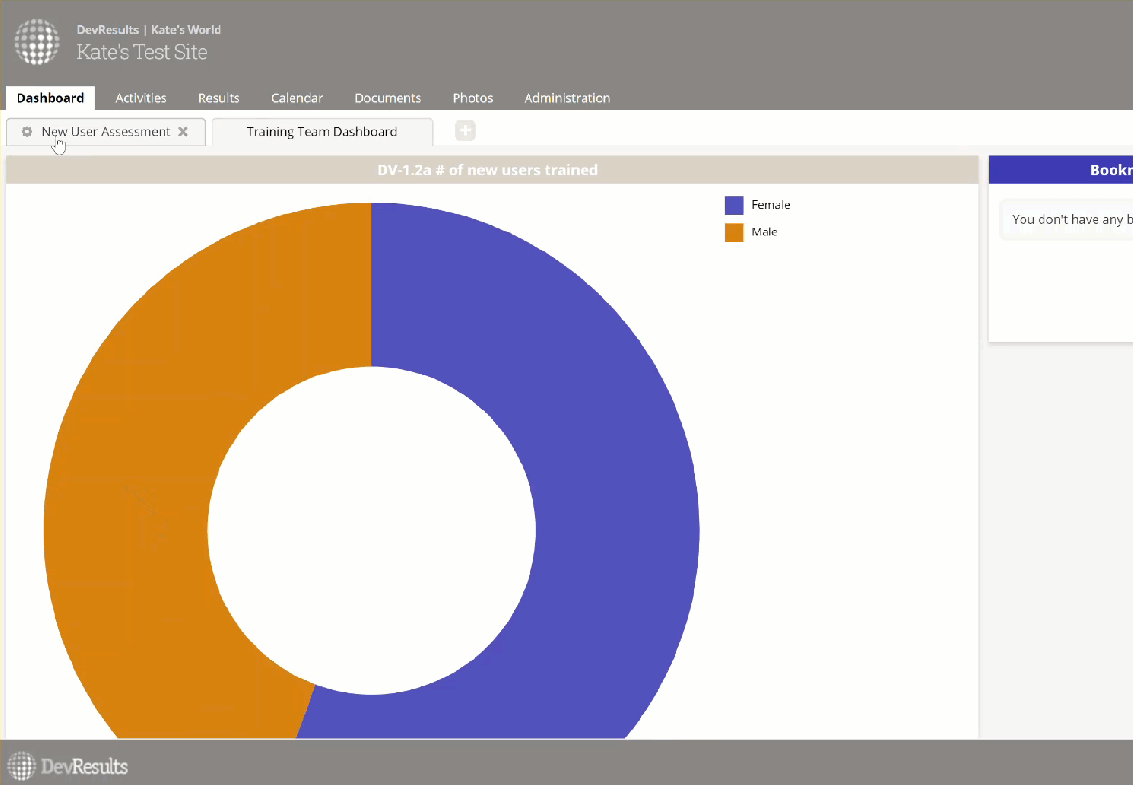
- Comparisons of total values over time. Pie charts are hard enough to view on their own; trying to also compare shapes to each other over time is cognitively challenging for our brains. Targets and Actuals Graph would be a much better choice for showing changes in totals over time, and even changes in proportions over time. Take these two graphs, for example:


Do these really help you distinguish that you worked with 6 females and 5 males in 2016 Q1, rather than 5 females and 4 males in 2017 Q1? You have to interact with the pies to understand the difference in the total and the relative proportions, and at that point the visualization has lost its strength as an at-a-glance comparison.
- Comparisons where only small differences separate values from each other. So, for example, if you have 4 pie slices that equate to 10%, 9%, 11%, and 8%, realistically your brain will process these as being more or less the same size. Even with only two categories, this can get tricky:
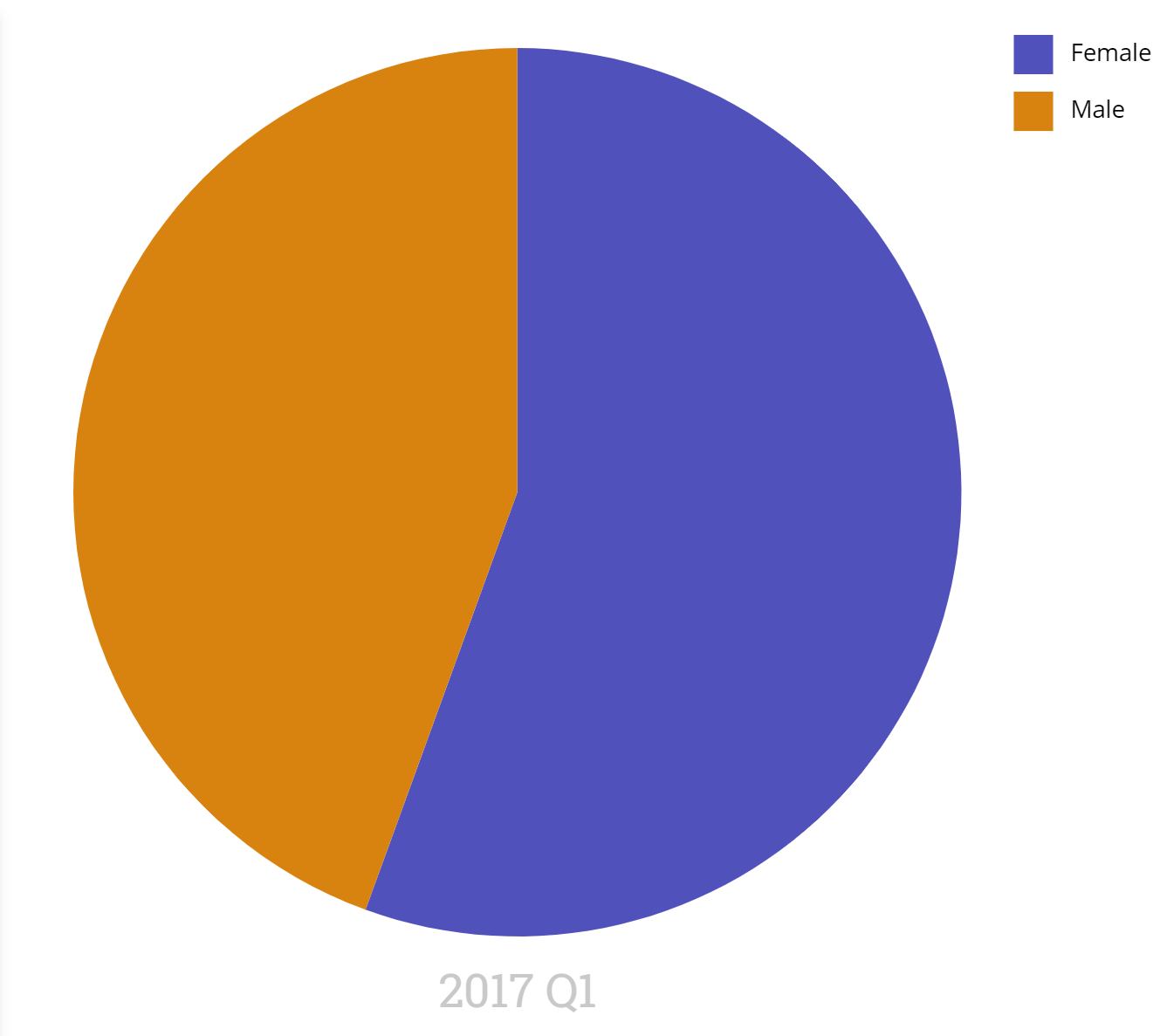
That image shows 5 females vs. 4 males. But does the pie chart really show us this meaningfully?
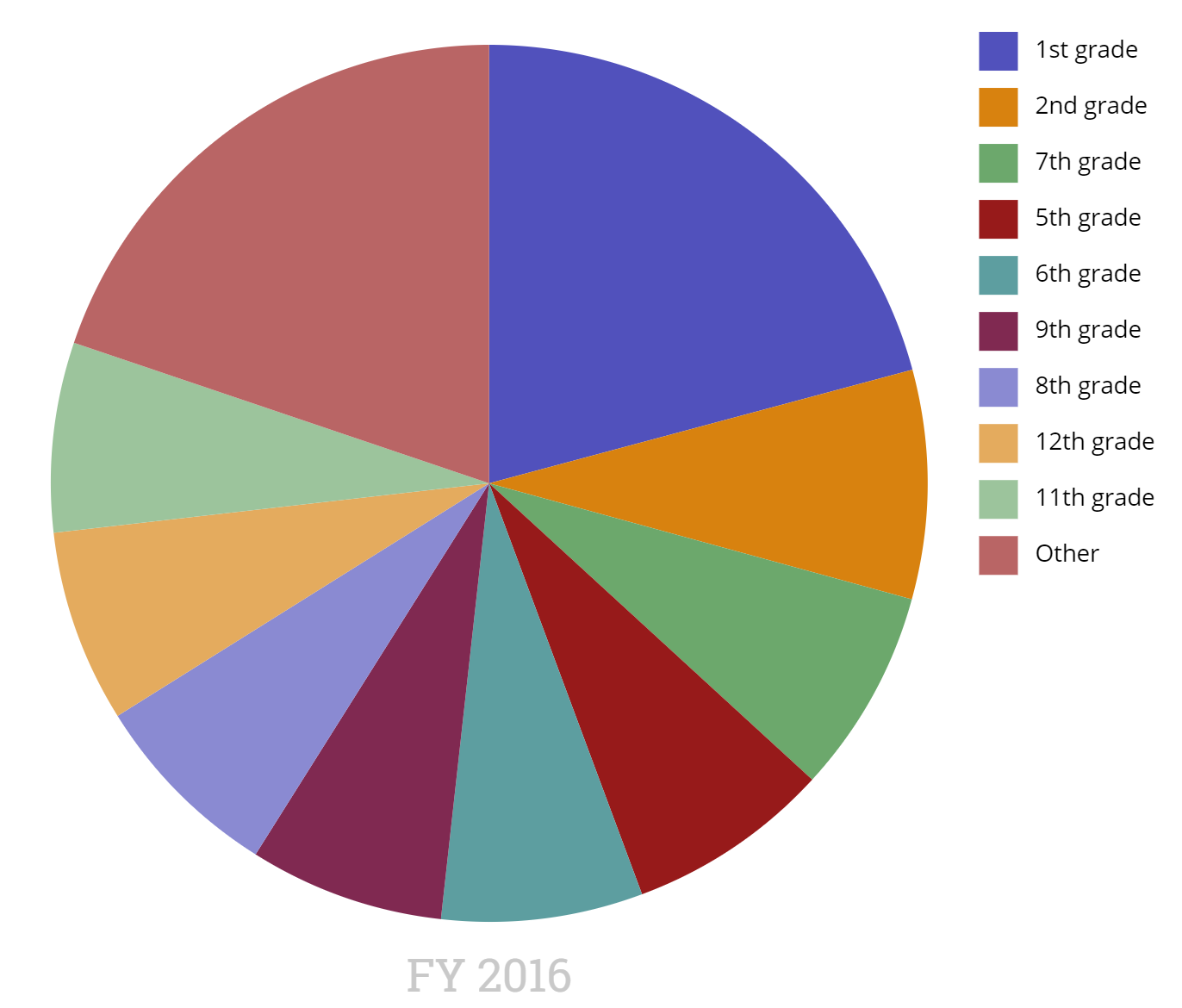
- Comparisons between a lot of different categories. The more pieces in the pie, the more time your brain spends trying to compare shapes to each other. For comparisons of lots of categories, try a Targets and Actuals Graph using bars.
Configuration Options
As with all visualizations, you can select which disaggregation to view, view data incrementally or cumulatively, select a color palette, and filter it by project and geography.
When you download a pie chart, you can choose whether or not to include the indicator name in the image.
Pie Chart has a few unique configuration controls, too:
Style
You can opt between the donut and pie styles. The default is donut.

This is the pie:

Legend
You can choose to show or hide the legend. This setting is most often used to hide the legend on dashboards to keep it visually less cluttered.
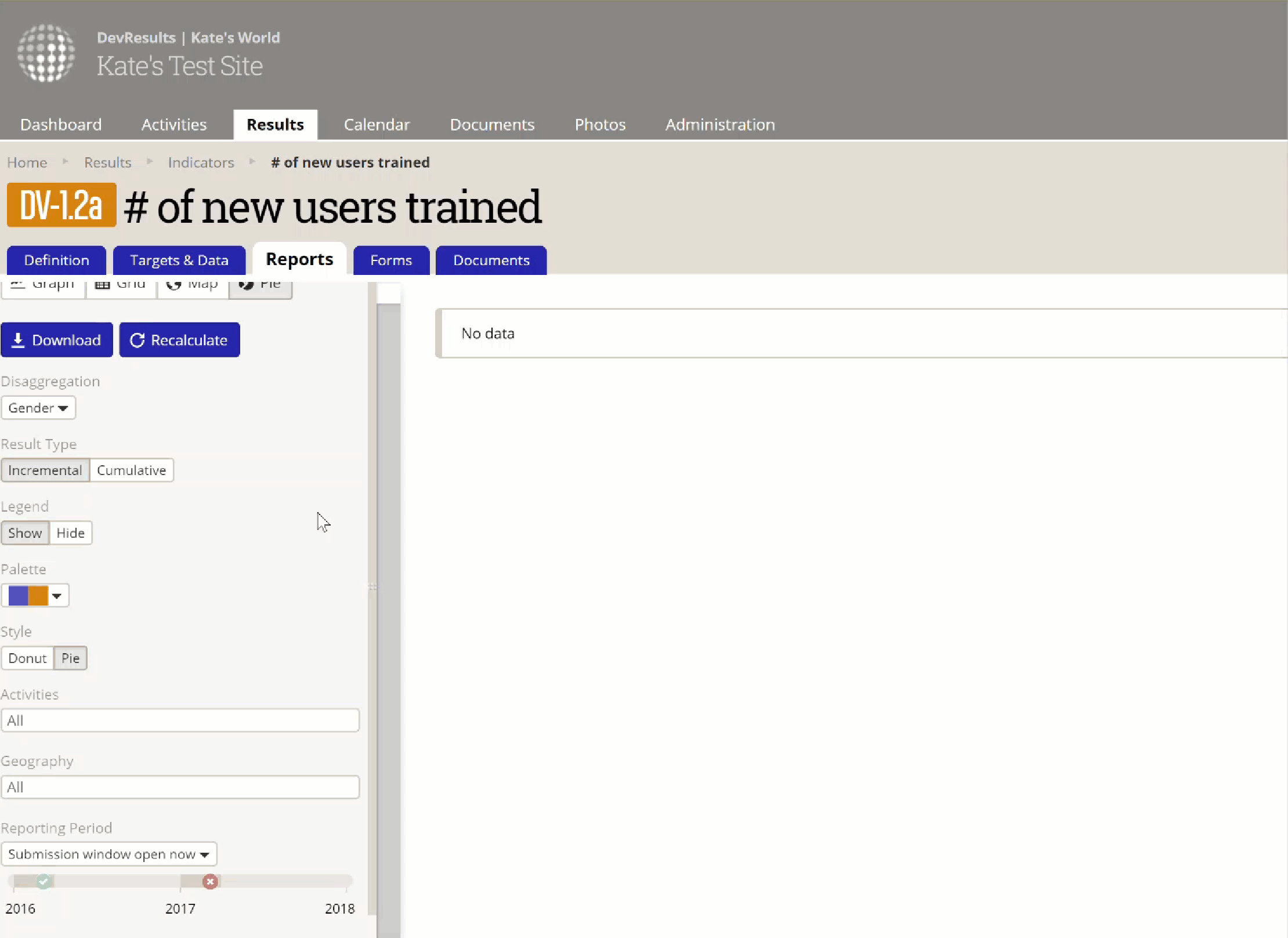
Reporting Period
Pie charts display a single reporting period at a time. We've designed the reporting period selector here to handle two different scenarios: Automatic and Fixed.
Automatic: We created this setting specifically for using pie charts on dashboards, when you might want a dashboard to automatically update the visualization to show you only the most recent reporting period. In this case, whenever the dashboard is loaded, the pie chart will automatically update to reflect the reporting period selected here.
When one of the automatic reporting period options is selected, the reporting period timeline won't let you select a different reporting period.
We provide four automatic options:
- Last closed: This will display the reporting period whose End Date is most recently in the past. (e.g. the most reporting period that was most recently active)
- Last closed submission window: This will display the reporting period whose Submission End Date is most recently in the past. (e.g. the most recent reporting period that you accepted/calculated data for)
- Open now: This will display the reporting period whose Start Date is most recently in the past and whose End Date is still in the future. (e.g. the reporting period that's currently active, but may not yet have data being collected for it)
- Submission window open now: This will display the reporting period whose Submission Start Date is most recently in the past and whose Submission Window End Date is still in the future. (e.g. the reporting period that you're currently accepting/calculating data for)
For these automatic options, consider these reporting periods:
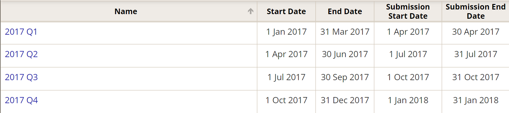
Let's assume that we are looking at this visualization on 1 May 2017. The visualization would display these:
- Last closed: 2017 Q1, whose End Date was on 31 March 2017.
- Last closed submission window: 2017 Q1, whose Submission End Date was on 30 April 2017.
- Open now: 2017 Q2, whose Start Date was 1 April 2017 (in the past) and whose End Date is 30 June 2017 (in the future).
- Submission window open now: displays nothing, since no reporting periods are currently in an open submission window.
Fixed reporting period: This allows you to permanently select a specific reporting period. To do so, select "Fixed reporting period" and then click the icon in the reporting period timeline that represents the reporting period you wish to view. The dashboard and visualization will always display this reporting period, regardless of when it or its submission window closed.
Didn't answer your question? Please email us at help@devresults.com.